00%
Loading...

Print & Signage

keyboard_arrow_down

Role
Branding
Print Design

Client
Brews & Bites Cafe
Clima Design Technologies
Aqua Sushi & Juice Bar
Vida Eyecare
Coastal Eye Clinic

Date
2016 
2016
2016
2017
2020

Software
Adobe Illustrator

Role
Branding, Print Design

Client
Brews & Bites Cafe
Clima Design Technologies
Aqua Sushi & Juice Bar
Vida Eyecare
Coastal Eye Clinic

Date
2016 - 2020

Software
Adobe Illustrator

Perforated Sign

Perforated Sign

Brews & Bites Cafe underwent store renovations and a branding transformation to refresh its look. As part of this effort, the owner sought a window sign that would both attract attention and inform customers about the cafe's offerings. The resulting design is a perforated window vinyl sign that appears opaque from the outside while still providing visibility from the inside and allowing natural light to enter through.

The design of the sign emphasizes typography, aligning with the cafe's modern interior aesthetic. B&B's signature orange brand colour is prominently featured, complemented by a rich espresso brown background and white accents to highlight key information. Thoughtful spacing maintains a sense of balance throughout the design, ensuring readability and visual appeal.

Tradeshow Display

Tradeshow Display

Clima Design Technologies Ltd. needed an eye-catching design for their tradeshow display. The challenge was to attract many consumers to their display of Innova 2.0 air conditioner/heat pump and stand out amidst numerous other products at the tradeshow.

The resulting solution was a large format 3D popup banner to highlight all the product's unique qualities, paired with a podium design to bring attention to their brand. The final design maintained the sleek modern look of their product, showcasing only the essential information to keep it clean and not overwhelm. This design approach generated a significant amount of new interest in the product, resulting in a highly successful tradeshow for the client.

Juice Label

Juice Label

AQUA Sushi + Juice Bar, a local healthy food joint in Olympic Village, needed a budget-friendly label for their various fresh pressed juices. The challenge was to design one label that can be used across all the drinks and use materials that can be printed in-house at the print shop next door for easy access.

The resulting solution was a versatile label that captured the essence of Aqua Sushi + Juice Bar, with vibrant colours that match the different juices on the menu, along with listing its main ingredients. The client can use the same label for all the juices and just easily check off the box to indicate which one it is. There's also a space to put the date the juice is to be consumed by for their commitment to freshness. This cost-effective and flexible approach met the client's needs for quick turnaround times and convenience in printing the juice labels at the local print shop as needed.

Window Vinyl &
Lightbox Sign

Window Vinyl
& Lightbox Sign

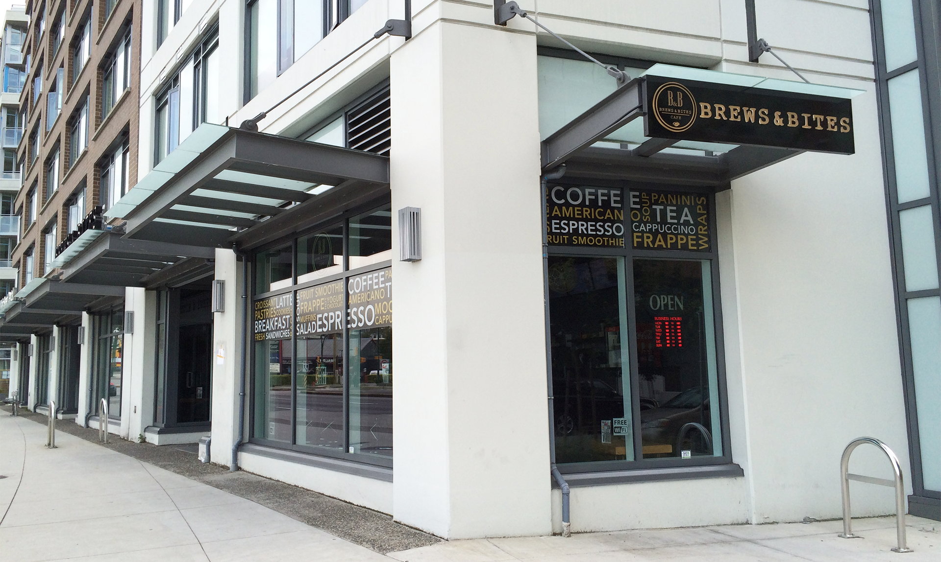
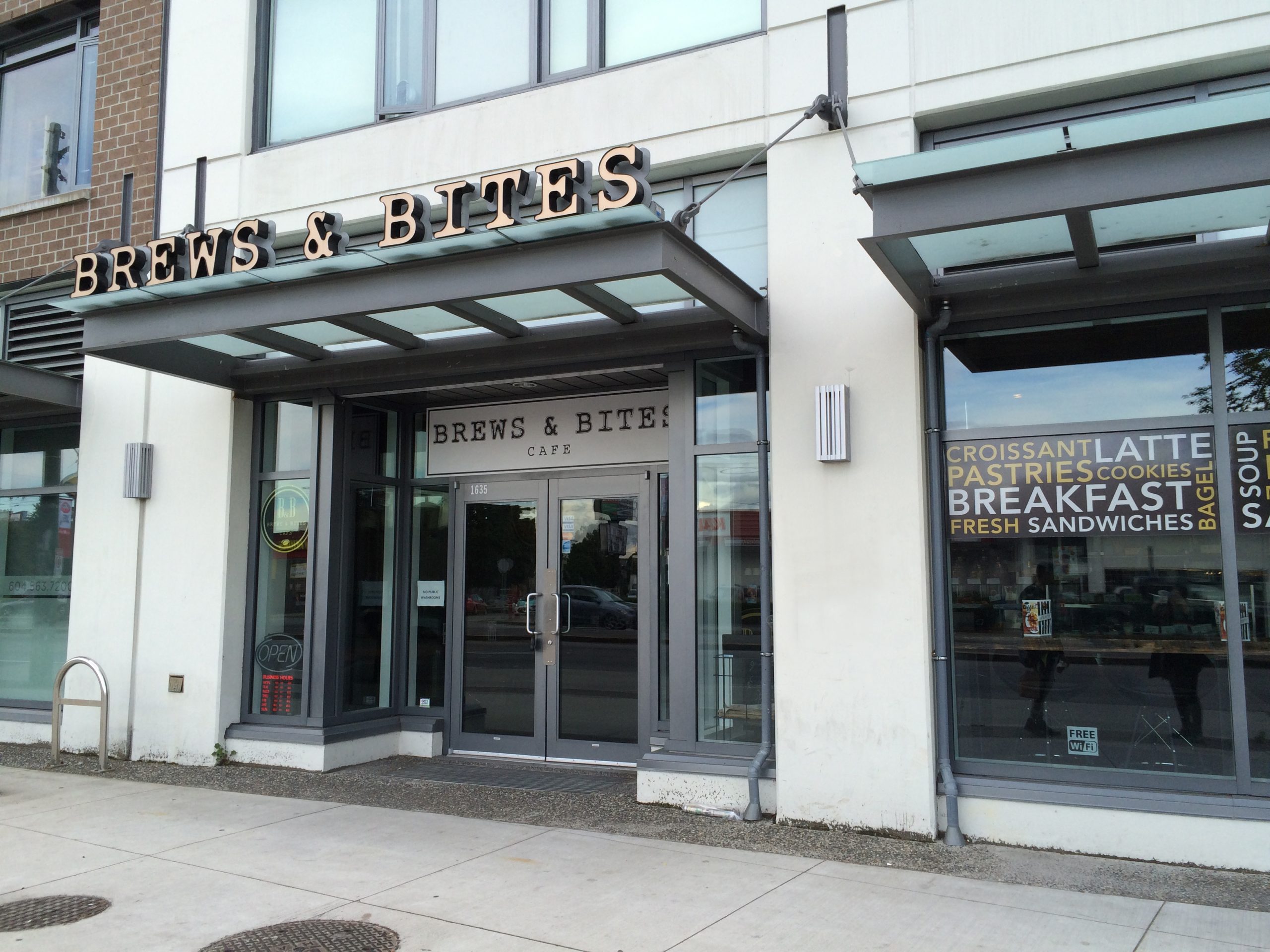
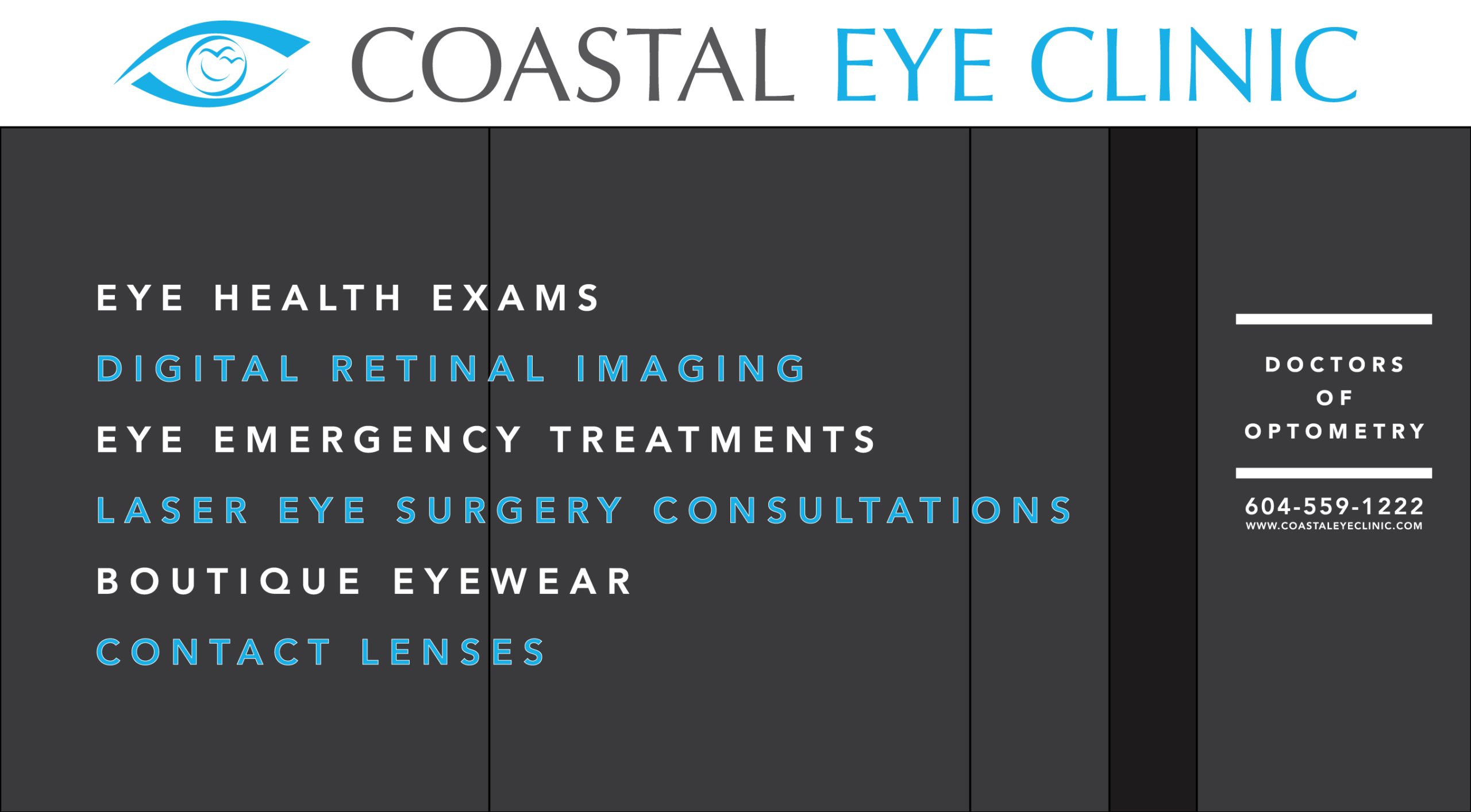
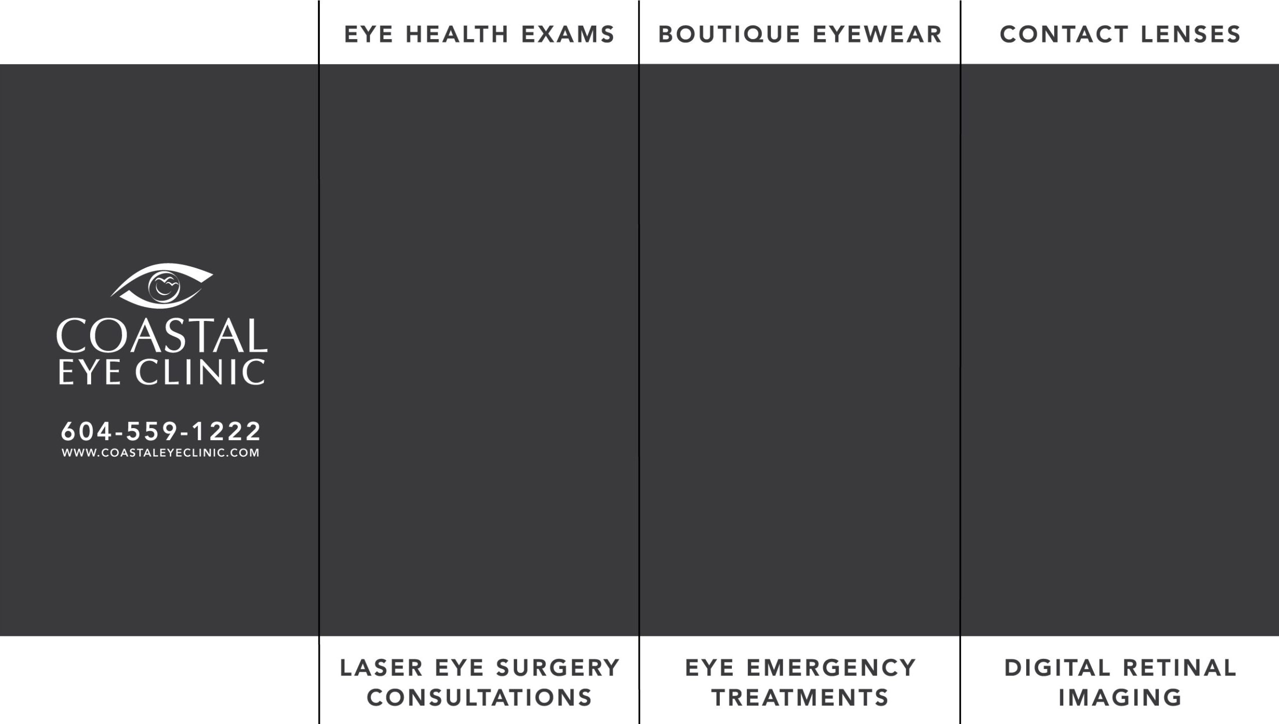
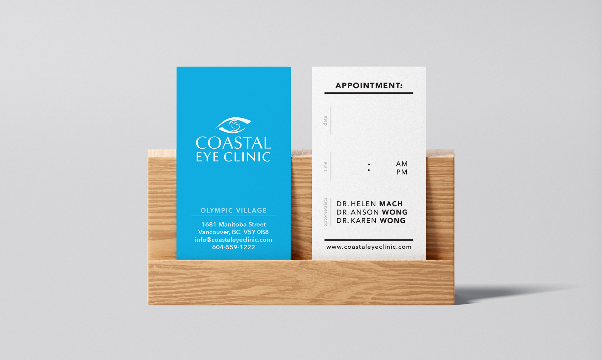
Coastal Eye Clinic, an optometry clinic in Olympic Village, wanted a new lightbox sign and window vinyl to attract new customers. The challenge was to catch the attention of pedestrians and drivers passing by and effectively showcase their brand, services, and contact details without covering the whole window.

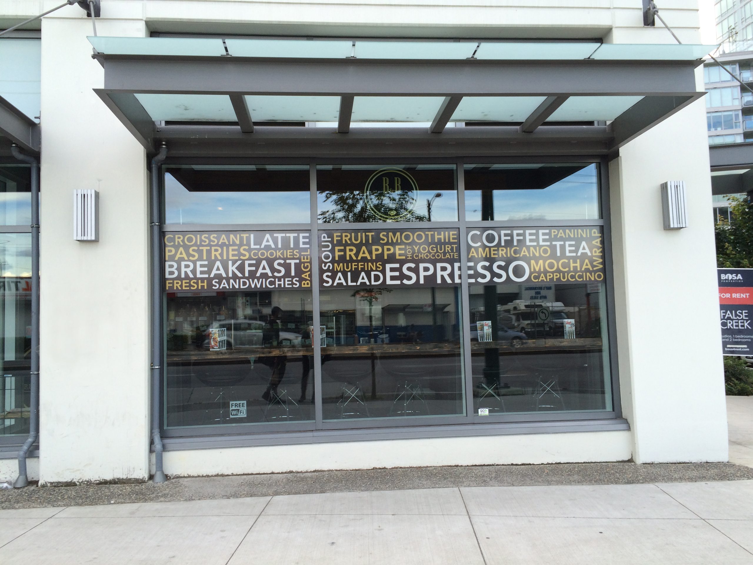
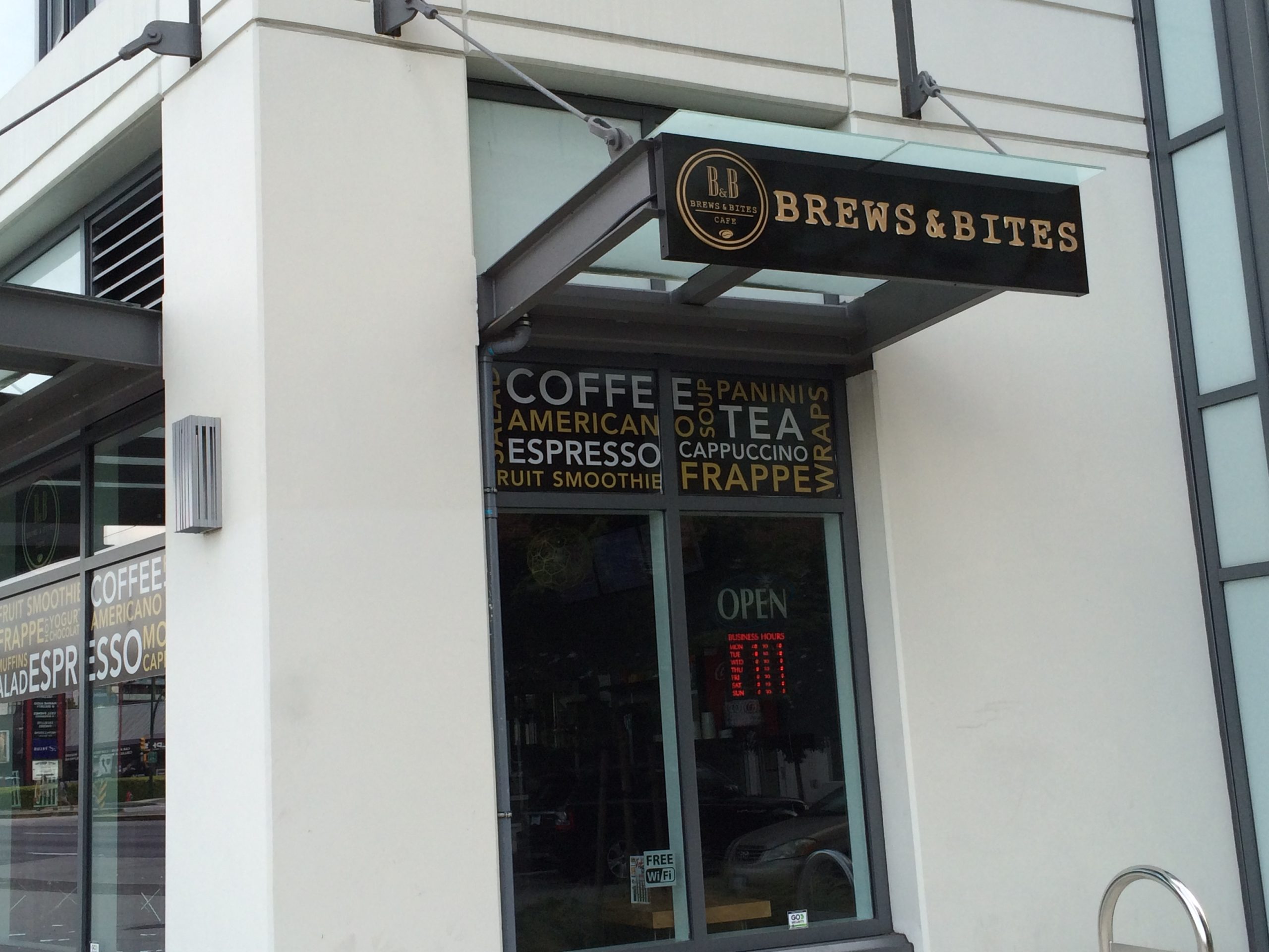
The lightbox sign ensures visibility even during nighttime hours. Meanwhile, the window vinyl on both the front and side windows utilizes clear and concise messaging, prominently displaying the clinic's contact information and services offered from all sides. Together, these signage elements create a cohesive and inviting storefront that attracts the attention of passersby and encourages them to engage with the clinic.

Referral Pads

Referral Pads

Vida Eyecare, an optometry clinic in Vancouver, sought a design for their 2-sided referral pads to streamline information delivery during patient appointments. With limited space available, the challenge was to organize a significant amount of information while maintaining clarity and readability.

Strategic use of whitespace was essential to create more breathing room and reduce clutter. Additionally, a coloured background was selectively applied to certain areas to aid in visual hierarchy, defining content sections and guiding the reader's eye. These design choices minimize information overload and enhance readability. The final design effectively balances form and function, meeting the client's needs for clear communication within a compact format.